Looking For A Simple Website Fast? | $150/Month Website

Website Giveaway! Enter Here

Follow us on

Web Design Best Practices

Creating a website that stands out requires more than just attractive visuals. Following web design best practices ensures your site is comprehensive and user-friendly. You need to focus on user experience, clear navigation, and consistent branding. These elements help guide visitors smoothly through your site and keep them engaged.

An authoritative website also builds trust with your audience. Detailed, well-organized content is key. Make sure your site is mobile-friendly and loads quickly. A fast, responsive website enhances user satisfaction and can improve your search engine rankings.

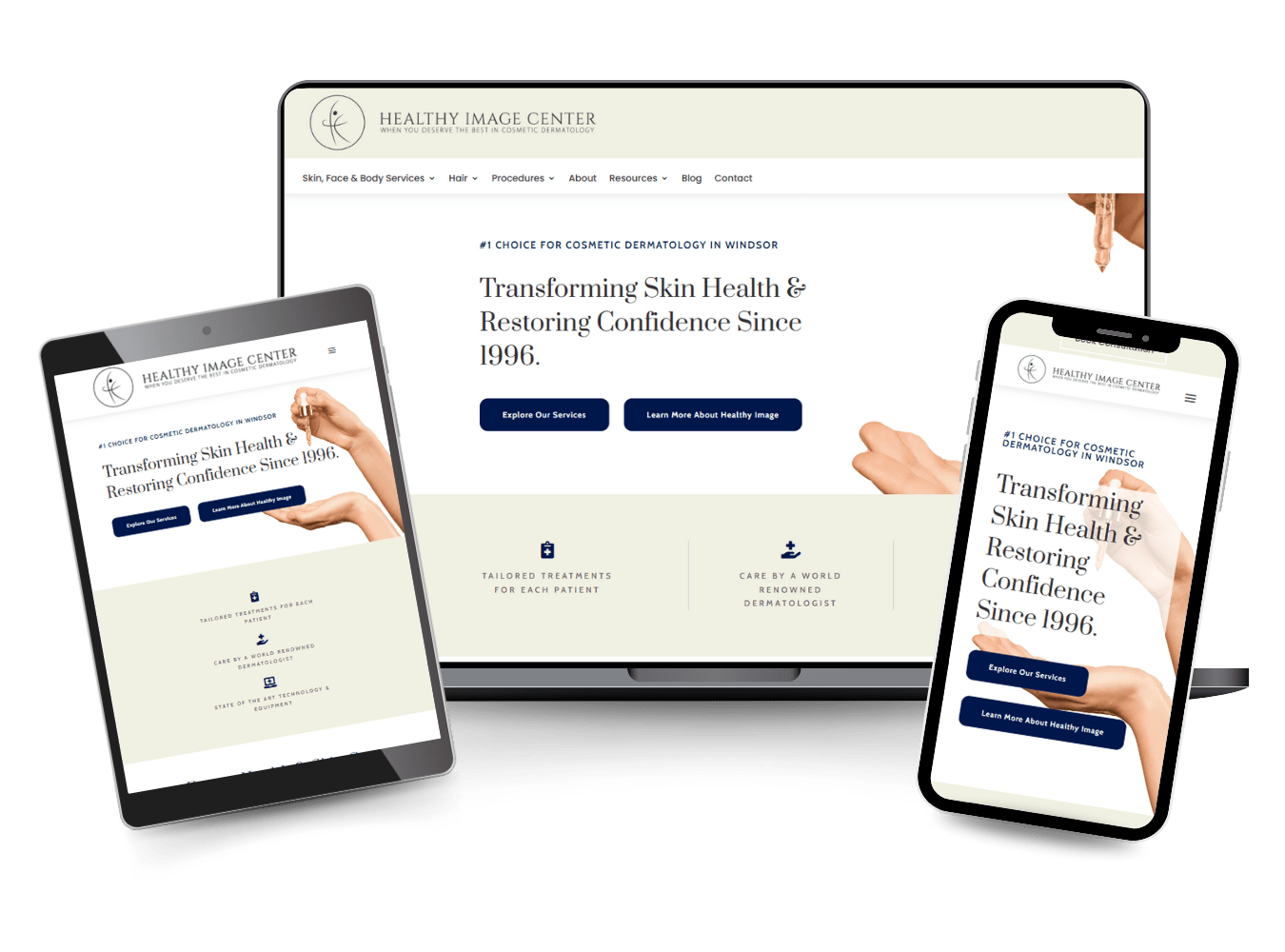
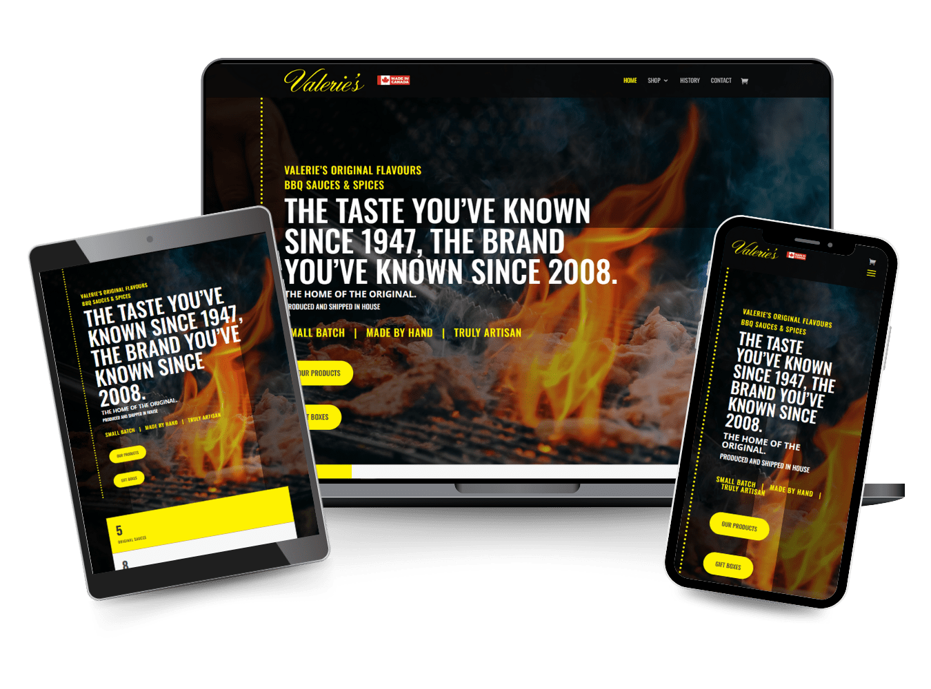
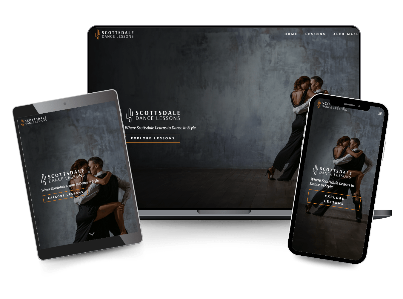
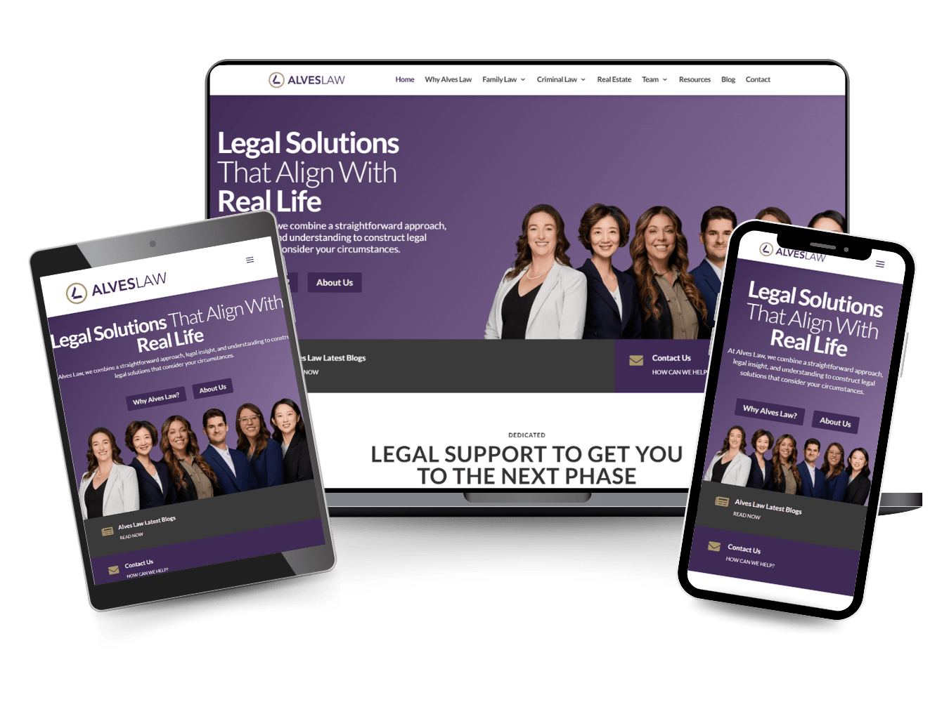
Responsive design makes your website accessible to a broader audience. This means your site adapts to different screen sizes and devices, from desktops to smartphones. A user-friendly and visually appealing design keeps visitors on your site longer, helping you achieve your goals.

Understanding User Experience

User experience (UX) is crucial for keeping visitors engaged with your website. This includes creating intuitive designs, ensuring accessibility, and improving usability.

Principles of UX Design

User-centric design focuses on the needs and preferences of your users. A key principle is simplicity; avoid clutter and ensure that navigation is straightforward. Another principle is consistency, which enhances familiarity and comfort. Use the same fonts and colour schemes across the site. Responsiveness is also essential, meaning your site should work well on all devices, from desktops to smartphones.

Feedback mechanisms, like progress bars and notifications, let users know their actions are registered. This builds trust and satisfaction. Applying these principles will create a seamless, enjoyable experience for users.

The Role of Accessibility

Accessibility ensures that everyone, including individuals with disabilities, can use your website effectively. This includes adding alt text for images, which helps visually impaired users understand visual content. Use high contrast colour schemes to assist those with vision impairments. Enable keyboard navigation to support users who can’t use a mouse.

Implementing screen reader compatibility is vital, converting text to speech for those with severe vision impairments. Caption videos and use clear, simple language. By making your site accessible, you serve a broader audience and comply with legal standards.

Enhancing Usability

Usability involves making the website easy to use. This starts with an intuitive layout where users can find information quickly. Short load times are critical; slow websites frustrate users and drive them away. Effective calls to action (CTAs) guide users toward the desired actions, like signing up for a newsletter or making a purchase.

Use real-time search features and provide clear error messages to keep users on track. Regularly testing your site with real users can highlight usability issues you might miss. By focusing on usability, you improve the overall user experience and increase user satisfaction.

Essentials of Website Layout

When designing a website layout, focus on placing content strategically, employing visual hierarchy, and ensuring balance and harmony. These elements will create an engaging and user-friendly experience.

Strategic Placement of Content

Placing content strategically is key for an effective website layout. Important information should be above the fold, meaning it appears on the screen without scrolling. This ensures visitors see it immediately.

Use a grid system to organize content. Grids provide structure, helping you align elements consistently. Consistent alignment improves readability and navigation.

Additionally, place call-to-action (CTA) buttons prominently. CTAs should stand out by using contrasting colours and large, readable fonts. Their placement can significantly impact conversion rates.

Be mindful of white space. It separates content, making the layout appear clean and organized. Too much clutter can overwhelm users and degrade their experience.

Using Visual Hierarchy Effectively

Visual hierarchy helps guide users through your website by organizing elements based on their importance. This can be achieved through size, colour, and placement.

Headers should be larger and more prominent than body text. This draws attention to key sections and makes skimming easier.

Use colours to create contrast and highlight important information. Bold colours can indicate priority elements like headlines or CTAs.

Placement also influences visual hierarchy. Place the most critical information at the top or centre of the page.

Finally, maintain consistency in your design. Consistent use of fonts, colours, and styles reinforces the hierarchy, making navigation intuitive.

Achieving Balance and Harmony

Balance and harmony in web design ensure that all elements work together cohesively. Symmetrical layouts create a formal, organized feel, while asymmetrical layouts add dynamic elements.

Use a balance of text and images. Too much text can be overwhelming; too many images can distract. Aim for a harmonious mix that enhances readability and engagement.

Colour schemes play a significant role. Use complementary colours to create balance. Avoid overly bright or clashing colours that strain the eyes.

Consider the spacing between elements. Proper margins and padding create breathing space, preventing the layout from feeling cluttered. This contributes to a harmonious and user-friendly design.

Designing for Responsiveness

Designing for responsiveness is crucial in today’s web landscape. It ensures a seamless experience across all devices, from desktops to smartphones.

Adapting to Mobile Devices

When designing for responsiveness, you should prioritize mobile devices. Mobile-first design means starting with the smallest screen size and progressively enhancing functionality for larger screens. This approach ensures that your site performs well on smartphones, which is essential given the high volume of mobile internet users.

To improve mobile usability, avoid cluttered layouts and use large, readable fonts. Make interactive elements like buttons easy to tap without zooming in. Navigation should be straightforward, with minimal scrolling required. Mobile-friendly websites load quickly, ensuring visitors can access content without delays.

Employing Flexible Grids

Flexible grids are the foundation of responsive web design. These grids adapt the layout to various screen sizes, ensuring content is easily viewable on any device. Using a fluid grid layout means elements are sized in relative units like percentages, instead of absolute units like pixels. This approach allows content to resize smoothly.

Utilize CSS media queries to alter the layout based on different screen dimensions. Media queries enable you to create breakpoints where the design adjusts to offer an optimal viewing experience. Employing a combination of flexible grids and media queries ensures your design is adaptable and responsive.

Testing Responsive Design

Thorough testing is essential to verify that your responsive web design functions well across diverse devices. Utilize tools and frameworks such as BrowserStack or Google Mobile-Friendly Test to assess performance on various screen sizes and browsers. Real-world testing on physical devices complements these tools, offering a complete picture.

Automated testing scripts can simulate user interactions, highlighting issues like slow load times or broken elements. Always test on both common and less popular devices to ensure widespread compatibility. Comprehensive testing ensures that your responsive design delivers a consistent and high-quality user experience.

Visual Elements Usage

Using visual elements effectively can make a website more appealing and easier to navigate. This includes integrating high-quality graphics, choosing the right colour palette, and employing engaging visuals.

Integrating Graphics and Imagery

High-quality graphics and imagery grab attention and communicate messages quickly. Select images that are relevant to your content. This helps reinforce your message and keeps users engaged. Be mindful of file sizes; large images can slow down your website.

Consistent imagery can create a harmonious look. Using similar styles and tones in your graphics helps maintain a cohesive design. Tools like photoshop or Canva can aid in crafting and editing these elements.

Avoid stock photos that appear too generic. Unique, tailored images add a personal touch to your site. Icons, illustrations, and infographics can also effectively convey information.

Choosing the Right Colour Palette

Select a colour palette that aligns with your brand identity. Colour affects the emotional response of users. Choose colours that reflect your brand values and resonate with your target audience. For instance, blue often signifies trustworthiness, while red can evoke urgency or excitement.

Use tools like Adobe Colour to experiment with combinations. Stick to a limited palette of 3-5 colours to prevent overwhelming your visitors. Incorporate these colours in your text, backgrounds, and buttons for a unified look.

Consider colour accessibility. Ensure that text and background colours contrast well enough for readability. Websites like WebAIM offer tools to check colour contrast levels, ensuring your site is usable by all.

Employing Engaging Visuals

Engaging visuals like videos and animations can enrich user experience. Videos explain complex concepts quickly and can be more engaging than text alone. Ensure your videos are optimized for fast loading and are relevant to your content.

Animations can make interactions more intuitive. Subtle effects like hover states for buttons or smooth scrolling can enhance navigation. Ensure these animations are not too flashy; they should enhance, not distract.

Interactive elements like sliders or clickable images can also increase user interaction. These elements should be tested across devices to ensure they work well on both desktop and mobile platforms.

Navigational Components

Well-designed navigation is essential for creating a user-friendly web experience. Key elements include intuitive structures, clear hierarchies, and effective breadcrumbs and search bars.

Importance of Intuitive Navigation

Intuitive navigation ensures users can find what they are looking for without confusion. When designing navigation, focus on user experience. Your site’s primary navigation should be straightforward. Consider using clear labels for menus and buttons. Avoid jargon or technical terms that might confuse users.

Keep the number of menu items reasonable. Too many options can overwhelm users. Consistency across pages helps too. Users appreciate familiarity, so keep menus and navigation elements uniform throughout the site.

Hierarchy in Menus and Buttons

The hierarchy of menus and buttons helps users understand the structure of your site. Start with high-level primary navigation. Under each main menu item, provide sub-menu options to guide users deeper.

Use visual cues like font size, icons, or bolding to distinguish between levels in the hierarchy. This helps users understand what is more or less important. Place the most critical options in easy-to-find areas. For instance, top-level services should be in the core menu, while additional resources can be in sub-menus.

Incorporating Breadcrumbs and Search Bars

Breadcrumbs offer a trail users can follow back to their starting point. They reduce the risk of getting lost and improve navigability. Place breadcrumbs at the top of your page, just below the main menu. Use simple names for each breadcrumb link.

Search bars are vital for finding specific information quickly. Ensure the search bar is easy to locate, typically near the top of the page. Make it user-friendly by incorporating auto-suggestions and filters. This speeds up the search process and enhances user satisfaction.

Typography and Readability

Typography plays a vital role in how users interact with your website. Key factors such as font choice, text scannability, and contrast contribute significantly to readability.

Choosing Fonts Wisely

Selecting the right font is crucial. Sans-serif fonts like Arial and Helvetica are popular because they are clean and easy to read on screens. You should avoid fonts with intricate designs or excessive flourishes, as they can be hard to read.

Font size also matters. Body text should be around 16 pixels to ensure readability. Headings can be larger, but be consistent with your choices. Use font styles like bold or italics to highlight important information but avoid overusing them.

Optimizing Text for Scannability

Most users scan web pages rather than read them word by word. To make your text scannable, use bullet points and subheadings. These elements break up your content into digestible sections, making it easier for users to find the information they need quickly.

Short paragraphs and ample whitespace also help. Aim for 1-3 sentences per paragraph. Avoid long blocks of text, as they can overwhelm readers.

Ensuring Contrast and Legibility

Colour contrast between text and background is essential for readability. Black text on a white background is typically the easiest to read. If you use coloured text, ensure high contrast to avoid straining the eyes.

Accessibility is also crucial. High contrast improves readability for everyone, including users with visual impairments. Use tools to check contrast ratios and ensure they meet accessibility standards. Consider user experience for all possible scenarios to create an inclusive design.

Branding and Visual Identity

Branding and visual identity are key in web design. They help define who you are and communicate your values clearly to your audience. Your brand should be represented consistently across your site, ensuring that your message is conveyed effectively through design elements.

Incorporating Brand Identity Consistently

Your brand identity includes your logo, colour palette, typography, and imagery. These elements need to be used uniformly across all pages of your website. This creates recognition and builds trust with your users.

Make sure your logo is placed prominently, usually at the top left of your website. Choose colours that reflect your brand’s personality and use them consistently. Typography should align with your brand’s voice—formal or casual. Imagery, like photos and icons, should also align with your brand style.

Consistency across these elements helps to solidify your brand identity in the minds of your users. It’s crucial not only for aesthetics but also for a cohesive user experience.

Messaging and Branding Through Design

Your website’s design is a powerful tool for conveying your brand’s message. Think about what you want your visitors to feel or understand about your brand.

Using consistent messaging in headers, taglines, and call-to-action buttons is essential. Your visual design should support this messaging. For example, if your brand is eco-friendly, use earthy colours, natural imagery, and straightforward language to reflect this.

Pay attention to the mood and tone your design sets. Friendly, approachable brands might use softer colours and playful fonts. Professional, serious brands might stick to darker colours and formal fonts. The key is to ensure that every design choice reflects your brand’s core values and message.

Conversion Optimization

To boost conversions, focus on crafting compelling CTAs, designing high-converting landing pages, and building trust with your audience.

Crafting Effective CTAs

Crafting effective CTAs is crucial for guiding visitors. Calls-to-Action (CTAs) should be clear, concise, and action-oriented. Using strong verbs like “Buy Now” or “Sign Up Today” makes a big difference.

Placement matters; ensure your CTAs are above the fold and prominent.

Colour and contrast play a vital role. Buttons should stand out from the rest of the design. A/B testing different CTAs can help determine what works best.

Pay attention to personalization and make CTAs relevant to your audience.

Designing Landing Pages for Conversions

Designing landing pages with conversions in mind requires a strategic layout. A clean and simple design minimizes distractions and keeps the focus on the offer.

Headlines should be compelling and convey the value proposition clearly.

Visual hierarchy helps guide the visitor’s attention. Use images and videos to support your message but ensure they are optimized for fast loading.

Forms should be short and request only essential information to reduce friction.

Including social proof like testimonials, reviews, or trust badges can increase credibility. Make use of split testing to continually improve the performance of your landing pages.

Building Credibility and Trust

Building credibility and trust is fundamental to conversion optimization. Professional design elements such as consistent branding, high-quality images, and error-free content contribute to a trustworthy appearance.

Transparency about your products, services, and policies also builds trust.

Security indicators like SSL certificates and clear privacy policies reassure visitors. Make information about refunds or returns easily accessible.

Customer testimonials and case studies provide proof of satisfaction from other users.

Maintaining an engaging blog or resource section with valuable content can also build credibility over time. Addressing common questions and concerns through FAQs or chatbots helps provide instant support, further increasing trust.

Technical Aspects of Web Design

Technical aspects of web design include a range of practices that help create effective, accessible, and fast websites. Key areas include search engine optimization (SEO), coding standards, web accessibility, and site performance.

SEO and Coding Best Practices

SEO involves using keywords and meta tags so search engines can easily find and rank your website. Coding standards in HTML, CSS, and JavaScript must be followed to ensure your site runs smoothly across different devices and browsers.

Organize your code to make it clean and readable. Proper indentation and comments help future-proof your site.

Use tools like Google Lighthouse and Yoast SEO to check and improve your search engine performance.

Web Accessibility Standards

Web accessibility ensures that everyone, including people with disabilities, can use your website. Following the Web Content Accessibility Guidelines (WCAG) is crucial.

You should provide text alternatives for non-text content. Make sure your site is navigable using a keyboard alone.

Use ARIA (Accessible Rich Internet Applications) landmarks to improve structure. Colour contrast must meet minimum guidelines to ensure readability.

Ensuring Fast Load Times and Security

Fast load times are vital for user retention and SEO rankings. Compress images and use browser caching to speed up your site.

Minify CSS and JavaScript files to reduce load times. Use a Content Delivery Network (CDN) to distribute your content more efficiently.

Security is equally important. Implement HTTPS to protect user data. Regularly update and patch software to defend against vulnerabilities.

Use security tools like SSL certificates and robust passwords to keep your site safe from attacks.

Tools and Technologies

Effective web design relies on both intuitive design tools and robust development frameworks. Key components include tools like Figma for wireframing, and front-end frameworks for building responsive websites.

Leveraging Design Tools: Figma and Wireframing

Figma is a popular design tool used by many web designers. It allows for real-time collaboration, making it easier to work on designs with your team.

Wireframing is a crucial step in the design process. It helps you create a basic layout of your website, showing the structure and flow. This step is vital for planning the placement of UI/UX elements.

Using Figma for wireframing can speed up your design process. You can quickly create multiple wireframes and get feedback from stakeholders.

The software supports interactive elements, so you can make your wireframes clickable, providing a realistic preview of your website.

Utilizing Front-End Development Frameworks

Front-end development frameworks are essential for building responsive websites. Frameworks like Bootstrap and Foundation offer pre-written CSS and JavaScript code, ensuring your site works well on all devices.

Using these frameworks can save you a lot of time. Components like grids, navigation bars, and buttons are ready to use, allowing you to focus on custom features.

They also provide consistency across different pages of your site, enhancing the user experience.

In addition to saving time, these frameworks support cross-browser compatibility. This ensures that your website looks consistent across different web browsers, crucial for reaching a broad audience.

Feedback and Iteration

Effective web design relies heavily on user feedback and continuous iteration. These elements ensure the final product is both user-friendly and meets project goals.

Testing with Real Users

Testing with real users provides authentic feedback. This form of testing helps identify usability issues early.

By observing visitors interact with your site, you can learn what works and what doesn’t.

Comments and observations can guide adjustments. Real users bring perspectives that internal teams may miss.

Recruit a diverse group of test users. Diversity ensures you catch a wide range of potential issues.

Collect feedback continually, not just at the end of the development process. Simple surveys and direct interviews can reveal valuable insights.

Iterative Design Process

Iteration involves making repeated updates based on user feedback. This cyclical process helps refine your web design. Initial versions may be simple, focusing on core elements first.

Outlining key stages of your iterative process can improve clarity for your team and clients. Begin with wireframes, then move to more detailed designs. Always seek input at each stage.

Feedback loop integration is crucial. Each round of iteration should address past feedback.

This approach enhances sections that need improvement and maintains successful features. Always document changes to track progress and understand the impact of each iteration.

Website Launch and Maintenance

When launching a website, planning is critical for success. Post-launch, ongoing maintenance and timely updates keep the site functional and engaging.

Preparing for Website Launch

Preparation involves several steps to ensure a smooth launch. First, test all website features like links, forms, and payment systems.

Conduct user testing to identify any issues. SEO (Search Engine Optimization) setup is vital. This includes keyword research and meta tags to help your site rank well on search engines.

Create a backup of your site before it goes live. This saves you from potential data loss.

Ensure hosting and domain settings are correctly configured. Inform your audience about the launch through emails or social media. Lastly, monitor site analytics to track performance from Day One.

Post-Launch Strategies and Updates

Post-launch, focus shifts to regular maintenance and updates. This includes tracking site performance and resolving issues like broken links.

Software updates are crucial for security and functionality. Apply updates to your CMS (Content Management System) and plugins regularly.

Adding fresh content keeps users engaged and improves SEO. Regularly update blog posts or service pages.

Perform periodic backups to safeguard against data loss. Use analytics tools to monitor visitor behaviour and make data-driven decisions.

Engage with user feedback to make improvements. This helps in keeping the site user-friendly and relevant.

Testing new features or design changes can further enhance the user experience. Regularly review your SEO strategies to stay competitive in search rankings.

Special Considerations for Ecommerce

When designing an ecommerce website, certain elements require special attention to enhance user experience and drive sales. Focus on optimizing product pages and the checkout process to improve usability and increase conversions.

Product Page Design Best Practices

Effective product pages are crucial for ecommerce success. High-quality images from multiple angles and zoom features provide clarity.

Detailed descriptions including size, material, and unique features help users make informed decisions. Use bullet points for key info.

Add-to-cart buttons should be prominent and consistently placed. Consider adding customer reviews to build trust.

Interactive elements like size guides or customization options enhance user engagement. Ensure the page loads quickly to reduce bounce rates.

Checkout Process Optimization

Streamlining the checkout process is vital to minimize cart abandonment.

Offer a guest checkout option to avoid frustrating new users. Use progress indicators to show steps remaining.

Keep forms short by only asking necessary information. Implementing auto-fill options speeds up the process.

Make sure the payment gateway is secure and supports multiple payment methods.

Provide clear error messages if any issues arise. Offer order confirmation emails and easy return policies to build customer confidence and loyalty.

Frequently Asked Questions

Creating an effective website involves several key principles, including good layout design, ensuring mobile accessibility, and following Google’s user-friendly guidelines. Here are answers to some common questions about web design.

What principles should guide the creation of an effective website layout?

An effective layout should be user-friendly and aesthetically pleasing. Use a grid system to keep everything organized. Consistent typography and a clear hierarchy help users navigate your site. Ensure your design is flexible for various screen sizes.

How can web designers ensure their sites are accessible on mobile devices?

Responsive web design is key for mobile accessibility. Use fluid grids, flexible images, and media queries to adjust the layout based on the user’s screen size.

Test your site on various devices to ensure it works well on all of them.

What guidelines does Google recommend for developing user-friendly websites?

Google advises using clear and simple navigation, optimizing load times, and ensuring mobile-friendliness. Use descriptive and keyword-rich titles and headings. Avoid intrusive interstitials that can hamper the user experience.

What are some essential elements of a good website design checklist?

A solid checklist includes usability and performance tests, mobile responsiveness, SEO best practices, and quality content.

Make sure your site has an easy-to-find contact page, a fast load time, and is accessible to all users.

How can beginners practice web design to build their skills?

Beginners can start by working on small projects. Use online tutorials and follow web design blogs to learn new techniques.

Make use of design software to practice creating layouts and test your designs on different devices.

What are the best practices for incorporating media into web design?

Use high-quality images and videos that are relevant to your content. Optimize media files for faster load times.

Include alternative text for images to improve accessibility. Consider using lazy loading to improve performance on pages with lots of media.