One Page Web Design
A one-page website is designed unlike traditional, multi-page websites, it does not navigate through multiple links and pages. Instead, it’s structured around scrollable sections with key information. This keeps the focus simple. Each section is distinct without big menus and confusing links, allowing for smooth scrolling.

Advantages of Single Page Layouts
- Content is easier to consume.
- Particularly useful for portfolio sites, product presentations, and event pages.
- Improved user experience.
- Visitors can find information faster.
- Typically higher engagement rates.
- Easier to design for mobile users.
- Lower cost to design and develop when compared to a traditional website.

Key Components of Successful One Page Websites
Content Hierarchy and Organization
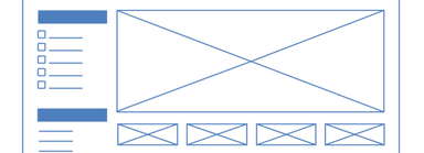
Well structured content is essential. It ensures that users can easily find what they need without feeling overwhelmed, dividing content into clear sections like Home, About, Services, and Contact.
Use headings and subheadings to guide users. This structure helps in maintaining a logical flow of information. Bullet points and numbered lists can break up text and highlight key points.
Effective Use of Typography
We should use fonts that are easy to read and fit the website’s theme. Choosing the right font size and line spacing enhances readability.
Emphasize important information with bold or italic text. Consistency in typography, such as using the same font for headings and body text, creates a cohesive look.
High-Quality Imagery
High-quality images grab attention and convey messages quickly. We should use relevant and high-resolution images to support the content. Images should be optimized for fast loading to ensure a smooth user experience.
Incorporating images that align with the website’s purpose can strengthen the visual appeal. Using alt text for images improves accessibility and SEO.
Branding and Color Schemes
Branding and color schemes create a unique identity. We should use colors that represent the brand and evoke the desired emotions. Consistent use of colors ensures a unified look across the website.
Logos and other branding elements should be prominently displayed. This reinforces brand recognition. By selecting colors thoughtfully, we can enhance readability and visual appeal.

Design Elements and User Interaction
For one page web design, the way we use design elements can greatly impact user interaction. Focusing on interactive elements, storytelling layout, and parallax effects helps create engaging and intuitive experiences.
Optimizing Calls to Action (CTAs)
CTAs need to stand out to catch the user’s eye. Action verbs like “get,” “read,” and “shop” create urgency. Bold, punchy language drives user engagement.
CTAs should be visually distinct using contrasting colors and larger buttons. Limited distractions around the CTA help in maintaining focus.
Regularly running A/B tests can identify the most effective CTA variations. By tweaking elements such as text, color, and position, we can continuously improve engagement and conversion rates.

Technical Aspects of One Page Websites
When creating a one-page website, there are several technical aspects to consider to ensure it performs well across different devices, loads quickly, and ranks well in search engines. By focusing on elements like responsive design, SEO, and performance improvements, we can build a site that is both user-friendly and effective.
Responsive Design for Mobile Devices
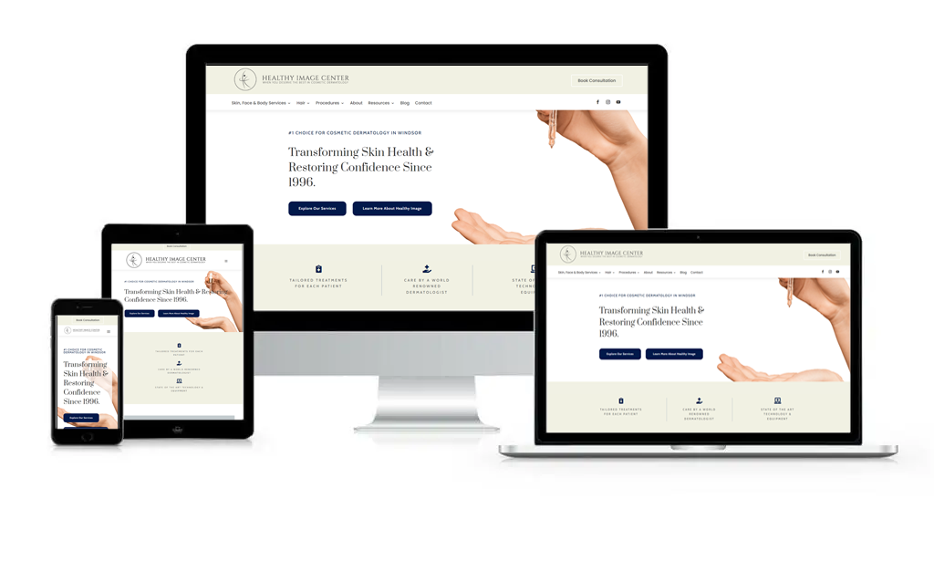
Ensuring our one-page website looks good on mobile devices is crucial. This means the design must be responsive, adapting to various screen sizes.
Optimizing for Search Engines (SEO)
SEO is vital for making our one page website visible in search engine results. Fast loading times, which we discuss further below, also positively impact SEO, as search engines favor quicker sites.
Loading Times and Performance
One-page websites need to load quickly to keep users engaged. Minimizing HTTP requests by using a single CSS file and reducing JavaScript can help speed up loading. Image optimization through compression ensures faster loading without sacrificing quality.
Ready To Build Your One Page Website?
Get started with us at Pivot Creative Media today. We create websites that set you apart and actually bring results.
Frequently Asked Questions
What are the benefits of using a single page website?
Single-page websites provide a streamlined user experience with faster load times. They are easy to navigate and focus the user’s attention on the most important content. This format is especially effective for mobile users and improves conversion rates by presenting information in a concise manner.
What are the best practices for creating a responsive one-page website?
Ensure your design is mobile-friendly by using a responsive framework. Test your site on various devices to check compatibility. Keep images and assets optimized for quick loading. Use fluid grids and flexible images that adapt to different screen sizes to maintain a consistent user experience.
